
- So I've seen a lot of hate for 1986 Donruss baseball in card collecting blogs. Is it really as lame as people make it out to be? Let's investigate.
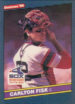
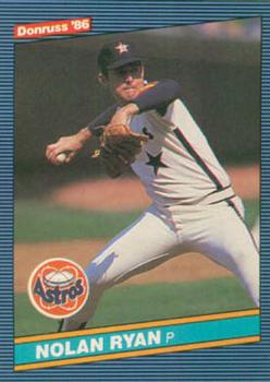
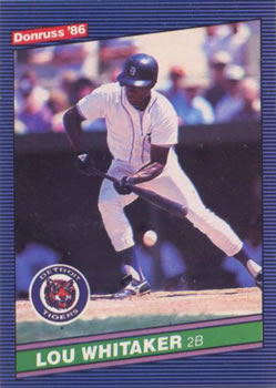
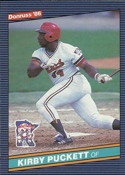
Upper Left: Brand and year.
Lower Left: Team logo.
Bottom: Player's name and position.
This might seem like basic stuff. But in the world of card collecting, it isn't. A name left off here, a position left off there, only Topps has logos now. Oh - and good luck getting the year on the front.
The photos are sometimes good, sometimes boring. I won't say buy this set for the photos. But it's not a set that should be known for bad photos either.
The bordering is distinct, yet in a subtle way. I like it, but apparently others don't. Are these the same people who claim a Topps set with a vanilla ass white border is the best ever? Probably.
Let's flip it over.
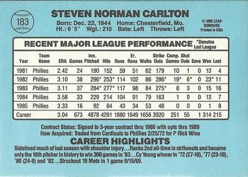
Is that - no, it can't be - black print on a white background, so I can actually read it?
Heck, even the outer light blue is better looking than a lot of colors Topps has used over the years.
- In other news, I purchased this 1972-73 Topps card from my dealer:

- So now that I need a Maury Wills for my Base Stealers project, he decided to not have cards for several years.

I like the 1986 Donruss cards, and that Kareem card is outstanding, congrats!
ReplyDeleteThanks.
DeleteGlad to see you scored a Kareem from your dealer. Nice card. As for 86D... it didn't make the Top 10 list when I ranked my favorite 80's flagship baseball card set designs. But I don't think it'd fall into my Bottom 10 either.
ReplyDeleteI thought about doing a 1980s ranking. Maybe I will when I'm not doing so many acquisition posts.
DeleteI'm cool with 86 Donruss. Totally agree with it getting points for having the brand, year, team logo, and player position, as well as a readable back.
ReplyDeleteIt's possible that I saw 3 or 4 bloggers rip 86 Donruss and it became 'Bloggers hate 86 Donruss' in my mind. Ha.
DeleteGenerally speaking, I'm not big on 1980's baseball card designs, but that being said, '86 Donruss is one of the earliest sets I can remember seeing, and I think because of that I do have a bit of an affinity for it.
ReplyDelete